Another session different Media – Acrylics

I wanted to try different combinations with acrylics with this colour mixing session. I wanted to see how different tones of each of the colours affected the mixing process too. For example a lemon yellow being mixed with a crimson red compared to yellow ochre mixed with the same crimson red.

Acrylic tones compared

I continued to work with the primary colours initially. I feel it will be a valuable way to record a visual vocabulary for future work.

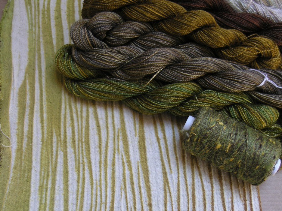
I used commercial made greens to get an understanding of what colours had been used to make up that specific green and compare the effects of using different tones of other colours on these.

Leave a comment