Assignment 2 Stage 5 A Primary colour sampler

I was not looking forward to this exercise in many respects , having done quite a lot of embroidery over the years I was concerned it may become laborious. At first it did appear to be that way. After a flourish of samples it was put aside until wimbledon! The excuse to sit; there was no excuse not to finish it.
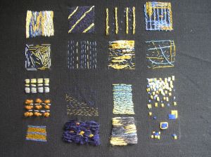
Finished sampler
Finished sampler

I had started this exercise with a thicker cotton thread and simple running stitch. Building geometric blocks with organised stitching.
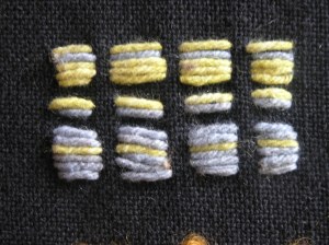
soft plant dyed cotton thread, working blocks of colour close together in blocks and strips of blocks.

The light blue made the yellow recede when dominating the block and the effect was similar for the yellow making the blue recede when the roles were reversed and the yellow was dominating. However when worked on a one to one, equal basis the yellow still managed to create this effect pushing the blue into the background, Dulling its appearance slightly. Although the effect was not as pronounced as in other samples and when building blocks of colour.

Regular running stitch using different thicknesses of threads.

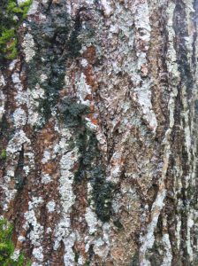
Seeing the effects from the previous sample I was expecting the blue to recede into the background however, the thickening of the thread and a darker shade emphasized this even more. The effect had potential to be exploited for textural work. An example using the bark formations of trees

OLYMPUS DIGITAL CAMERA

Working bands of blue seemed to behave differently. They dominated slightly pushing the yellow back this time.

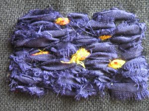
Shinmy space dyed silks covering the background. Uneven colour use, using bands.
Shiny space dyed silks covering the background. Uneven colour use, using bands.
sari silks
sari silks

Using the research that I had made from that sampler, blue was then used as the background for a single yellow stitch, This showed how the yellow still managed to be significant  when using colours of equal intensity. Was this because they were intensely saturated hues? would the effects alter with  less intense saturated hues?

Spaced out lines of equal intensity thin threads

Spaced out lines of equal intensity thin threads random and regular.

When thinner threads, wider spaced were used so the background was visible the blue seemed insignificant and did appear to recede to be barely visible. I had used a organised stitch for the yellow which did give more solidity to the colour too. The random placement of the blue thread was of equal intensity but appeared lighter and lacked solidity.  Previous samples had already highlighted the readiness of yellow to dominate unless the blue was in a block.Then it became a contender for domination. I felt perhaps the random stitch contributed to the lack of definition and competition with the yellow too.

changing thecolour ratios
changing the colour ratios

Although by organizing the blue thread in lines, providing more blocks of colour the yellow was still able to push forward sunny and cheerful! Why?

Returning to my research,

Both yellow and blue randomly placed
Both yellow and blue randomly placed in varying intensities.

The lighter blues held their position with all the yellows. However, as the hue became more intensely saturated it receded again until the darkest was insignificant despite there being no solid block this time, supporting my research.
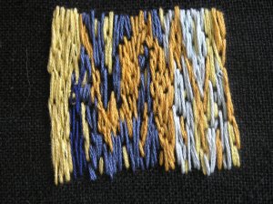
Building blocks of colour

This time exploring the previous outcomes of working the colours in solid blocks against each other I also explored whether different intensities affected the outcome dramatically.  Here you can see the colours fought for supremacy! The blue being able to even appear in the forefront even though it was still more effective  again –  the less the saturation. Perhaps the random stitching played its part….

Slightly more organised blocks of solid colour
Slightly more organised blocks of solid colour ?

At first this appears more organised but can you see how I have been cheeky doubling two experiments… I have indeed made solid blocks but craftily done that by a trick of an eye. The lines have been worked both close together and wider apart illustrating the ability to create illusions by careful use of colour. At the bottom the blue is almost unnoticeable. Any use of blue is thin lines and sandwiched between the yellow we already know to be the dominant colour. So en masse it appears yellow. It is not before nearly the top of the sample the blue is able to match the dominance and even then struggles until a solid block in its own right.

Interesting discovery!

Using solid blue/yellows but changing the yarn to a thicker matt effect wool that did not reflect the light, reducing the luminosity gave the blue more substance quite literally. This discovery could be used to an advantage in my work.

Working the colours to their full potential

With all that I have learnt so far, I gave the colours the chance to show off their full complementary potential by working this sample with an intensely saturated blue silk formed in a block form with no background showing and thinner lines of yellow. The yellow stood out as if above the surface whilst the blue took back stage – It allowed  the yellow to sing!

did the blue create the same effect when not in a block?

This experiment was almost a foregone conclusion as the background was black and gave a very similar effect to the block of blue in the previous sample. However, I felt the previous sample was more intense and gave more prominence to the yellow bands yet the blue had a presence too. In this sample the blue played a relatively insignificant part, perhaps adding a texture rather than a colour value. I did like the effect achieved and could see its potential as a way of bringing textures into a piece of work perhaps adding other colours carefully selected from my experiments in the next exercises.
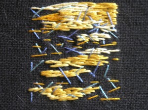
solid and random mixed luminosity and intensities

Using paler colours of the yellows and slightly stronger ones of the blues but working them differently I was able to see how this could play an instrumental way in achieving even more textures in more work. The blues faired better and became an interesting participant, not allowing the yellow to steal centre stage. They contributed a lovely effect of their own not comparable to the yellow. The yellow still had much to offer. Some of the blue stitches were oversewn by the yellow in the process and some laid on top. Those laiod on top resumed a recedent postion again as before but when grouped loosely together created a unique texture. Definitely another way to exploit their colour properties in textiles.
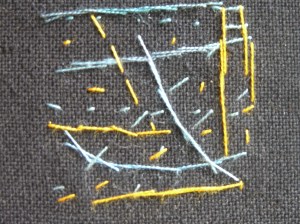
Changing their roles.

By working with the information I had gained from the previous samples I was able to work another sample supporting my findings and confirming the ability to manipulate the effects to my advantage when working. I increased the luminosity of the blue but this meant a less intense hue. I then increased the intensity of the yellow, subtly playing with the chemistry? The 2 hues were now closer together resulting in a more equal dominance. The use of the ‘lighter’ blues brought them into play more. The contrast in the sample from the other samples where the differences were highlighted was very evident. I now knew how to provide both colours in equal intensities, very useful sometimes in my work.

Slightly more saturation in the blue
Exploring this theory further with chain stitch and slightly more saturation in the blue

Again making a sample reflecting a few of the ideas blocks and space this time in an organised pattern for both colours I experimented altering the stitch to chain stitch. Whilst the blue did start to receded slightly, the solid colour  managed to absorb the yellow in the bottom right, creating a less intense colour. Where the roles were reversed the blue top right seemed to change too.

By this time I had pursued more research into artists, reading and looking at the way they used colour. By trying to explore this in the small sample squares it became more interesting.
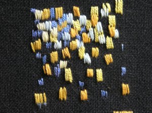
Cezanne uses blocks of brushstrokes.

Painting by stitch whilst reading about Cezanne, an artist I had always felt drawn too. He worked by applying small brushstrokes of colour that became blocks, allowing the eye to blend and colour mix. I worked on the principle in stitch working different shades of blue and yellow of similar thicknesses close together in blocks of 4 strands or stitches per block. I really liked this effect and the blending happened by magic. I could see how strong images could be built up for future work with this technique. It was giving a wonderful texture and life to the sample and I found it invigorating. Definitely a technique I plan to use.

Exploring different combinations of the blocks

My final sample I asked what, if and how different combinations of the colours in the blocks were affected by each other. I made this sample with blue and yellow of equal intensity and similar properties in the threads – thickness, cotton/silk. When the small single blocks were moved it affected the colours with the blue gaining a grey tinge to it when moved away from the yellow, perhaps needing to compensate for  some of the background/yellow differences? It was not as pronounced when moved closer to the yellow (bottom right) although it did seem to be still affected.

Layers upon layers everywhere I look

Whilst an awareness of developing an idea for a theme later on in this course plays, dances in the background, certain things are becoming apparent to me. The things I am attracted too. The ‘themes’ that keep presenting themselves to me. I sometimes look for, feel drawn too or I fall into time and time again throughout my work.

In every way I can think of ‘layers’ are there. Emotional, physical, sensory and socially. The act of ‘peeling away’ the layers to find that what is hidden beneath. Is this course not a peeling away and a building up of layers to find the creativity, ideas and ways of working?

The change of the seasons has always fascinated me. The drama of winter yet for me the subtleties of spring and autumn that takes us to that drama. The sensory overload through the seasons. Even someone not to overcome with nature can find sensory connections to a season.

The seasons extend through other areas of life. Through age, work, marriage and relationships. We attach the ‘autumn of ‘ and ‘spring chicken’ to imply an age, a stage and we all appreciate the analogy. We are gardeners of life.

So for me a feel ‘themes’ are finding or have found me. It is for me to put them together personally, individualistically, creatively. I feel a real connection with this idea creatively but also personally. Life guides us, influences us but ultimately we can choose which bits have a greater impact. We also get to choose how we respond to it’s influence.

Becoming my own constructive loving critic ?

I do not know about you but I can easily pick holes in my own work. Compare my efforts to others and insist I fall far short even though the aim of each person may have been entirely at juxtapose positions. That would be on a normal day!

Doing this course has in a way took me back a stage I do not seem to have the time for one thing to work let alone play with my own ideas. That leads me beautifully on to just – What is that ‘own’ work? In trying to expand my skill base, ideas and approaches I have come to a no mans land again today. I was following exercises dutifully, diligently but somewhere along the way I lost the ‘me’.

I started working for myself creatively a few years ago to use natural fibres, learn to dye, weave and spin, not necessarily in that order I hasten to add. I have been to the classes and workshops, taught myself to dye and it is a work in progress but very exciting. I hold workshops myself to encourage people to indulge in their own creative side. To share my knowledge. I had a clear out when moving house last summer of all undesirable synthetic ‘stock’ resource fabrics I just was not into. Leaving me with cottons, wool and linens; natural fibres, patterned and plain. Sounds wonderful. Mmmm its still not quite there.

As I work through these exercises what is becoming more and more clear to me is my love of creating my own fabrics to work with. When ideas come they  seed themselves in the very basic level of fabric. How am I going to create the fabric colour, texture or pattern. I suppose that is what the course is all about; to learn to do just that. I have always had an interest in taking the raw material from basics and being creative.

However, even at this level; only just starting the second assignment the rumblings are there. It is just not good enough. The work that is. Its not me. It is not my materials, my natural colours. However, to achieve a bounty of fabrics to work on at this stage is so time consuming. I do as much as I can and feel inadequate.

I need to bridge this gap between my priorities on my experience and time versus my ideals, wants and wishes for my work. I find that very frustrating whilst exhilarating at the same time. So I resort to fishing and ferreting in my commercial fabric baskets and choosing fabrics that once held appeal and now I cringe as the fabrics I really want to use are homemade ones. Time; there is never enough!

Positively, It is so rewarding to come to this crossroads, turn around and look back. Remember the issues that gave concern at the beginning. They quite often are forgotten whilst contemplating this new challenge or have progressed at the very least. This log does provide a comprehensive idea of the challenges, the development and the evolving of the ‘you’ I remind myself that THIS is a very important part of the course. To evolve, re define and progress. It is not static and just as you get those comfy slippers on of ‘I am’ you really need to be asking ‘really?’

So I welcome the restlessness of today. I know that now this has been spoken out loud and is no longer a niggle gnawing away, it will be addressed albeit slower than I may like. A transformation through small steps more each day I will build on the existing ‘me’ ‘fabrics and work. The power of knowledge cannot be underestimated. It is power. By acknowledgement, reflection and then incorporation into my daily work, I am authentically ‘Me’ Accepting of time, health, family constraints. reminding myself of how far I have come.

Stage Four Colour Moods and Themes Exercise One

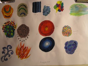
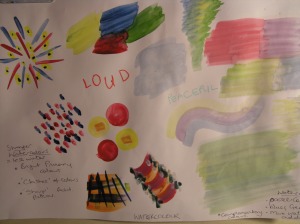
This exercise caused me uncomfortable episodes when first visited in Project One and I was determined to overcome this. Being able to express feelings. I was aware my lack of art skills held me back too. This said I spent longer than the recommended half an hour to compensate for these weaknesses.

first attempts
first attempts

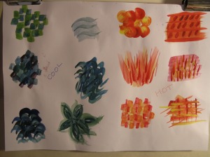
I was pleased with elements of the first attempt to take three pairs of opposite words hot/cold; fast/slow and calm/busy I also worked initially on happy and sad but they were the examples I was least happy with. I loved the hot/cold circles and really felt for me they captured the essence and feel of heat and cold, what it feels like to be them -red and blue ; the primary colours. The calm blues, greens and lilacs against the hectic reds, oranges, yellows  dots and dashes frantically ‘being busy’.

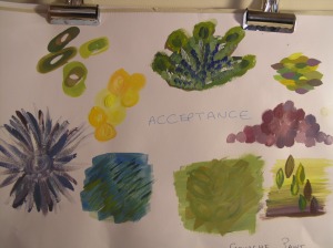
I wanted to explore feelings that evoked colours and shapes more intensely. I choose anger and then acceptance. Layering appeared a theme again. Being locked in by a building of feelings of anger. The colours becoming more intense the more angry you become. In contrast ‘ acceptance’ also gave me the feeling of layering the feelings of calm. The greens, blues, purples, yellows which ties in with the spiritual recognition of the colours purple. The enlightenment of yellows and natural colours of greens. Bubbles in both. Sharp quick movements in anger with slow flowing movement of acceptance.

Anger with colours of intense reds and oranges the restriction of dark blacks and brown purples.
Acceptance with colours of blue, green and blues, yellows and whites.
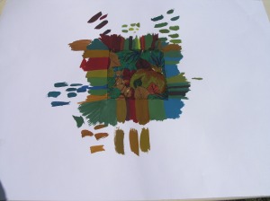
Hot and Cold
Hot and Cold

I was reasonably pleased with my response to the hot and cold. It was also an opportunity to use different media; Gouache, acrylics and water colours which all have a variety of appeals.

mixture of media
mixture of media

Project Three Stage Three Recording Colours accurately Exercise Four

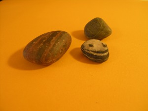
I choose a few items to work with a lemon, Lime and 3 stones and some golden yellow background paper.

chosen items
chosen items

I decided to concentrate on the stones as only 2-3 objects were required and felt they would push me further with this exercise.

3 colourful stones
3 colourful stones

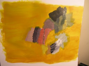
I was expecting tonal values to change in the shadows and approached the colours confidently but was surprised to what degree they were affected. They were also paler than I anticipated, more subtle.  There were many colours in the items themselves despite seeming on first glance a red/black, a blue/green and a black/white stone. There were all the tones in between too on closer inspection and found myself engrossed for over an hour. The shadows were the most enlightening very often not representing the background colour of golden yellow at all, more lilac-pale violet and blue green!

recording colours from 3 dimensional objects

It felt strange to not be creating an object and I still wonder if I have approached this accurately. I believe only brush strokes were needed. It did make a primitive piece of ‘art’ in its own right which also had its lesson to teach me. Analogies work as a progression of an idea albeit based on the colour, texture, patterns or a combination of some or all. It really started to loosen my head up, which I always knew would be an issue!

You can see by the strips of colours and the palette the wide range of colours used. I found the strips very useful in comparing the colours up close before committing to the colours.

making colours
making colours

I found this a very useful exercise to give me confidence in my ability to identify the colours and translate them effectively and give me the opportunity to do this. I found mixing on the paper in the background colours helpful. I am developing methods that work for me.

Stage Three Recording Colours accurately Exercise 3

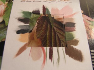
Really enjoyed this one. I spent time finding an image, a fresh one from my gardening magazines as I have been a bit lazy in the sketchbook. I wanted some new material. I have been really thinking about my personal stamp on things. What I want to translate into textiles. It always comes back to nature. The colours the textures and shapes, particularly the layers of the seasons. The image I choose reflected this beautifully. I made a choice of acrylic paints today, adding the gloss of the magazine and the shiny leaves.

OLYMPUS DIGITAL CAMERA
pink roses, green and bronzed leaves

On first glance I dismissed this one as although it seemed colourful to me , I was concerned it did not fit the criteria of ‘being rich in colour’. I looked closer and realised it was a perfect example. So many colours in a 5 cms square and colours I love and feel work so well together from a gardening point of view.

I used one of my sons recent birthday card envelopes as a tester strip, only cutting it into strips to add to my finished work after the exercise.

Cut up strips of an envelope to act as tester strips to match colours accurately. they could be put alongside the area I was working on.

I found that many of the shades/tones were made up of several colours and subtle changes gave the shades I needed for adjacent areas. For example the browns were a combination of crimson red, violet and/or ultramarine blue and yellow ochre. These colours were added in larger or smaller quantities to achieve the varying tones. White was not always applicable maybe flesh tone or lemon yellow was more appropriate.

Using the masking frame to ensure colours were mixed accurately!

I decided to use the edge of the masking square to make absolutely sure I had obtained the colour I wanted before adding in a flat brush a mark to the edge of the page. I did allow some artistic licence where there were lines of colour in the image dissecting the colours I made this same lines in my brushstrokes of the final colours.

Varying the coloured marks to reflect the image

Stage Three Exercise Two

I choose a very colourful piece of fabric keeping in my love of greens and browns or so I thought. The piece on closer inspection had reds, blues yellow- greens! There were many tones of each of those indivdual colours too. I was initially working inside the house but it was difficult due to low light levels to appreciate the subtle differences. I decanted outside in the sunshine!

matching fabric colours

I really enjoyed this exercise. The subtleties were challenging but gave me an appreciation of what tones made up the colours and a slight adjustment could make significant colour variations. The previous exercises on different tones of the colours helped in my choices. You can see may explorations into achieving the right colour on the edges of the finished experiment. I also found the drying of the paint affected the colour and had to be accommodated when considering mixing the colours. Different artists techniques could be appreciated doing this exercise such as The Impressionists; Van Gogh where they mixed their paints on the canvas using their eye to assist more acutely in the mixing process.

More experiments with the colour wheel using different medias

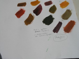
I am getting used to the effects of acrylics and so to have a formal study of the colour mixing  would prove useful at this stage. I took the primary colours through from one colour to the next. I had problems mixing purples and violets which were very quickly turning to browns and often needed a touch of  third colour! This may be easier as I accumulate more of the commercial colour tones.

browns and purples
browns and purples.
dry brushes mixing colours

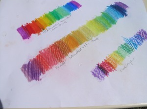
I made quick studies of soft/oil pastels and wax crayons. I hope to come back to more detailed studies breaking down the tones to include a variety of saturation levels. The pastels blend well and this may prove useful as I enjoy working with the blendable media.

pastels and wax crayons

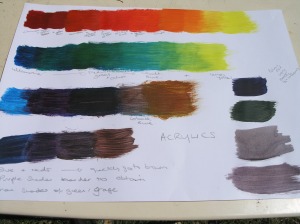
Another session different Media – Acrylics

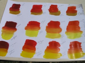
I wanted to try different combinations with acrylics with this colour mixing session. I wanted to see how different tones of each of the colours affected the mixing process too. For example a lemon yellow being mixed with a crimson red compared to yellow ochre mixed with the same crimson red.

Acrylic tones compared

I continued to work with the primary colours initially. I feel it will be a valuable way to record a visual vocabulary for future work.

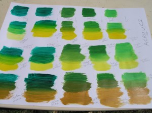
I used commercial made greens to get an understanding of what colours had been used to make up that specific green and compare the effects of using different tones of other colours on these.

Colour mixing Stage three Exercise One

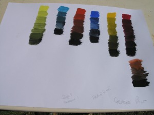
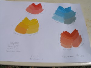
This exercise was to develop the skill of colour mixing. Being able to mix the colours you eyes see. Appreciating the colours that are needed to achieve the tones of colours that you need. My first session I ‘played’ with the colours adding whites, then blacks to a few different colours.

Adding Black
Adding Black
Adding white
Adding white

I compared adding a pink rather than a white.

Comparison of adding white or pink

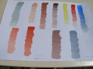
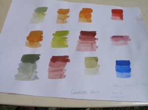
My initial colours were limited to explore the full range and comparisons. I stuck to the primary colour red, blue and yellow in gouache. I then used my surplus paints on my palette to create combinations.Using the white to create different tones and saturation’s within these colours.

Just add water
Just add water

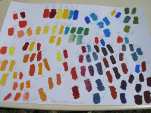
I experimented with water to dilute the colour and create different tones and saturation’s too. Finally I started from a fresh palette and used as many combinations as I could do in the time  with the 6 gouache colours. I used notes to give me a guide to how I made the colours to aid future studies.

6 Gouache colours - Mixed
6 Gouache colours – Mixed