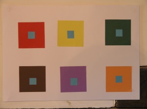
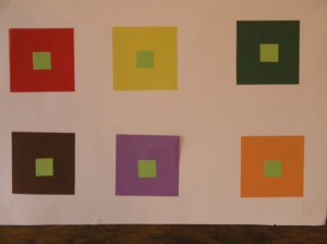
In some ways I was really dreading this exercise convinced it’s subtleties would be wasted on me! However, I dutifully did as requested and cut coloured squares and constructed the ‘illusions’ pinned them up above the fireplace and waited for the illusion to wash over me, also for my children to return from school! Together we sat most of the next hour maybe two observing and I must say we had great fun with this exercise. I kept the exercise pinned up for several days.
The colours did indeed alter our perception of each square. Depending on the colour in the middle, our eyes did seem to be adjusting and compensating. Creating colours we knew not to be there. It appeared to add the intermediate colour, ‘the jump’ between the colours. Some inner squares seemed to be prominent and others receded into the background. for example; darker backgrounds like brown with a lighter colour such as pale green seemed to make the small square seem further away or smaller in contrast the dark blue small square on a pale yellow larger background seemed to make the small square larger or closer. I had made 4 examples with different coloured small, inner squares. Some of the inner squares developed a haze around them of the colour that we could use to connect them with the background. For example the dark blue small square on a lilac larger square seemed to develop a ‘pink’ haze around it.


I did enjoy researching this exercise using relevant texts that had been recommended and are included in the bibliography for Project Three. Initially it was to confirm I had actually achieved the purpose of the exercise, understood the effect my eyes had witnessed. This in its own way confirms another element of the exercise, we do not always trust our eyes! I knew the colours that were definitely there as I had constructed the coloured square examples yet I was seeing something else I had not put there. This did highlight how important when translating colours it is to trust your senses especially your eyes.
Two books particularly were of interest. Colour; a workshop for artists and Designers D Hornung and Interaction of colour Josef Albers. I did find the rest of the recommended texts such as Itten hard to find and very expensive which was a pity as I was interested in taking a look at them. However, they may very well appear further into the course.

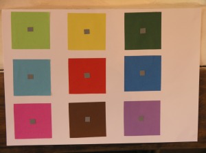
Even from the photo above you can see the effects. The grey square at the bottom right with the lilac background is almost obscure. It has melted into the background. The same coloured grey square on a yellow background (top in the middle) appears very dark grey, more prominent.
